Hatchet Granny
Client
Cimcie Nichols
Service
Logo Design, Package Design, Brand Positioning
Location
Chicago, IL
Nectar of the Goths.
Hatchet Granny is a non-alcoholic botanical elixir brand born from founder Cimcie Nichols' personal journey through heartbreak. The brand needed to translate its authentic gothic, alternative aesthetic into packaging that could appeal to mainstream consumers while maintaining its unique edge and emotional resonance.
The Challenge
How do you make "nectar of the goths" accessible to everyone? The core tension was balancing Hatchet Granny's distinctive dark, whimsical personality with broad market appeal. The brand needed to stand out in the rapidly growing non-alcoholic beverage space without alienating consumers unfamiliar with gothic subculture. The packaging had to communicate both the artisanal, small-batch nature of the product and its functional benefits—adaptogenic mushrooms, botanicals, and genuine emotional comfort.


Our Approach
We developed a comprehensive brand blueprint and positioning strategy that positioned Hatchet Granny as unapologetically alternative while emphasizing universal themes: healing, comfort, and community. Rather than softening the gothic aesthetic, we leaned into it as a differentiator, using it to signal authenticity and craft in a category often dominated by clinical wellness messaging.
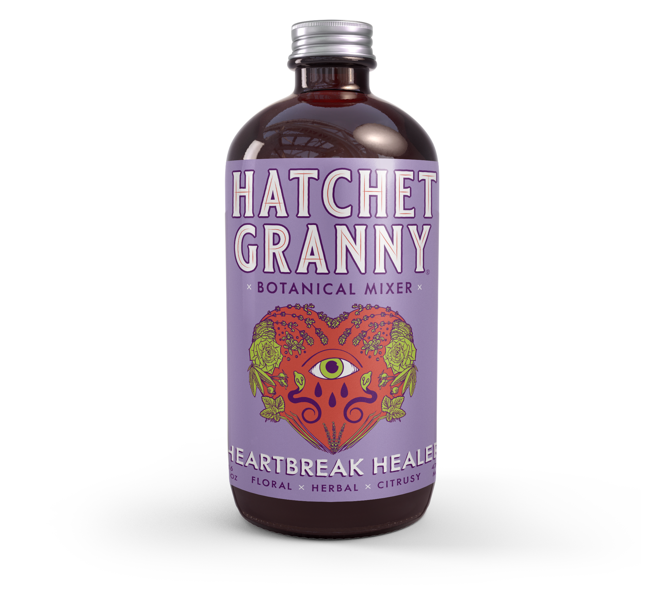
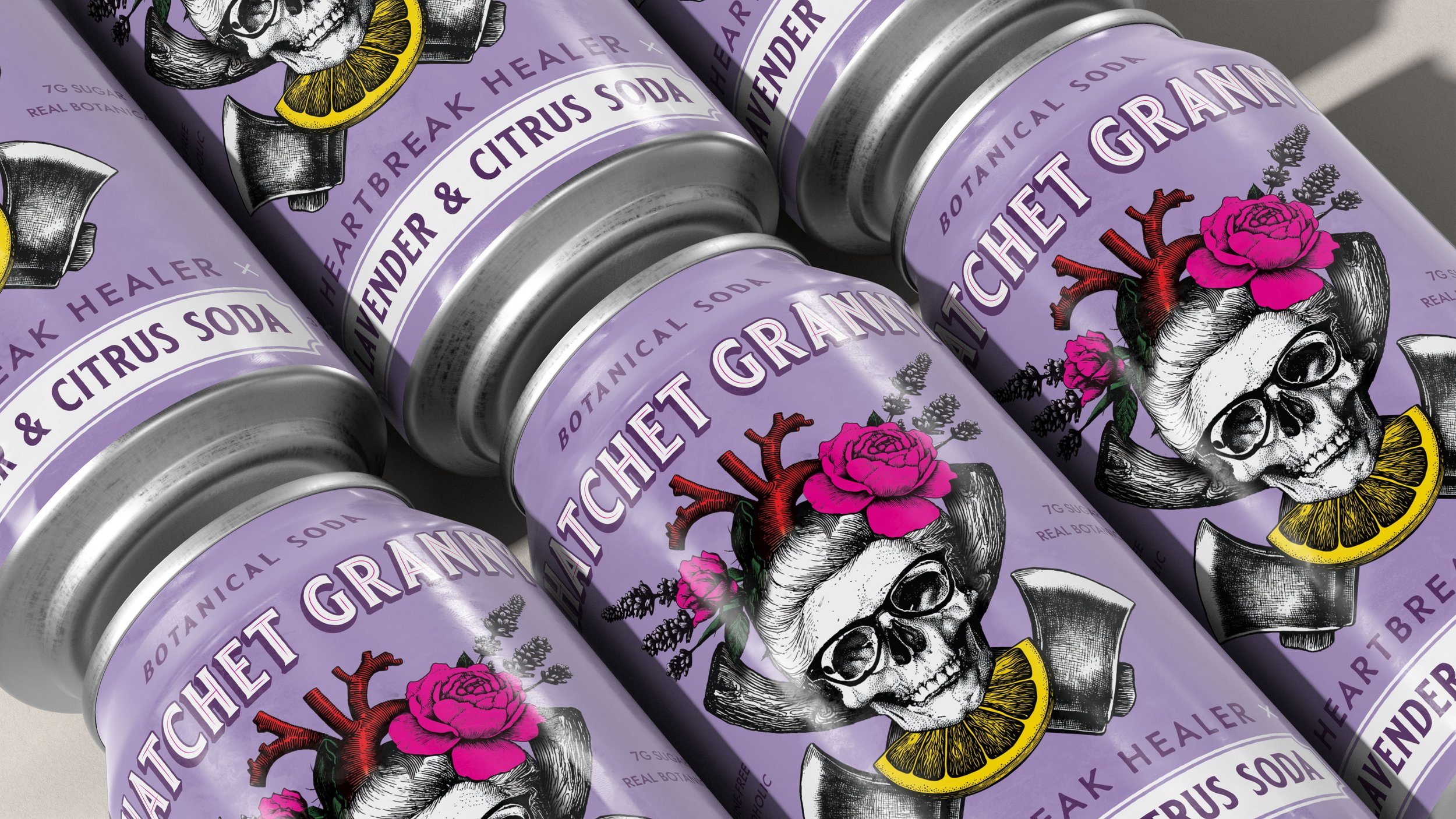
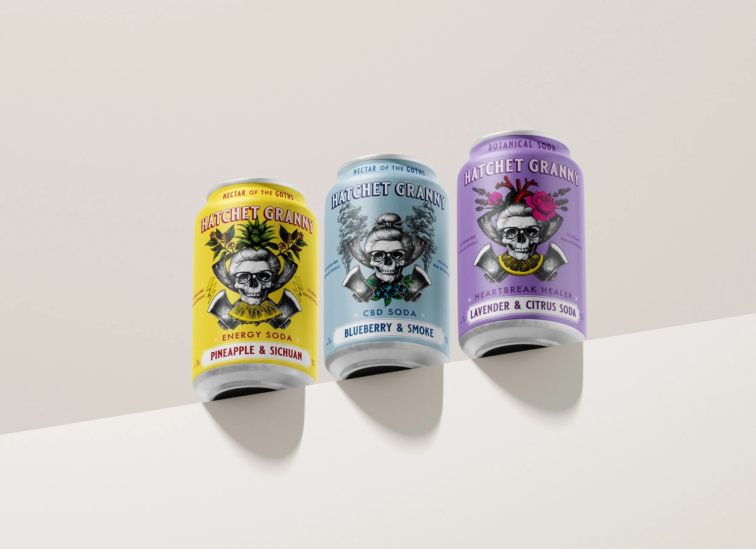
Through multiple design iterations across two versions of 16 oz bottles and the botanical soda line, we refined the visual language to balance dark mystique with approachable charm. The packaging design evolved to feature:
Gothic-meets-whimsical illustrations that feel more storybook than cemetery
Jewel-toned color palettes (like the lavender label for Heartbreak Healer) that soften the dark aesthetic
Clear, benefit-driven messaging that communicates "herbal hug" and emotional support alongside product attributes
Premium craft details that signal quality and intentionality
The Result
Hatchet Granny now owns a distinctive position in the non-alcoholic beverage market—immediately recognizable, emotionally resonant, and commercially viable. The brand successfully bridges alternative culture and mainstream appeal, creating a visual identity that invites curiosity rather than intimidation. The packaging works equally well in gothic specialty shops and mainstream retailers, with pop-up activations across Los Angeles, Chicago, Savannah, Portland, and Atlanta.
The iterative design process allowed the brand to test and refine its market approach while maintaining creative integrity, positioning Hatchet Granny for growth as it expands from direct-to-consumer sales toward wholesale distribution and a future brick-and-mortar gothic elixir bar and teahouse.

