Case Study
Brand Refresh
Case Study Brand Refresh
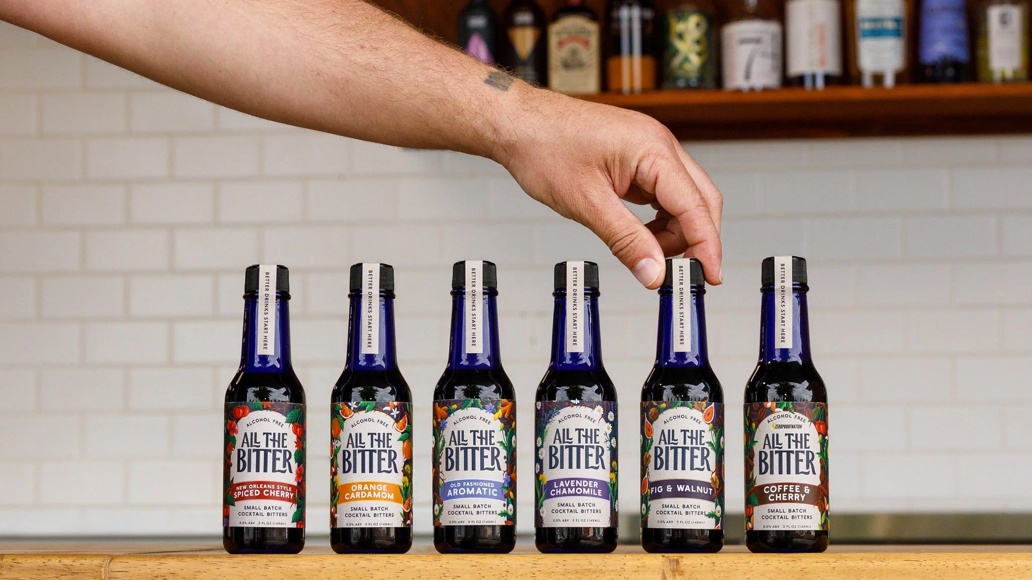
How I helped All the Bitter update their branding without alienating customers.
Category
Brand Refresh
Services
Logo / Labels / Boxes / Sales Collateral / Social Media Templates / Merch
Location
Chico, CA
Problem
Packaging didn’t reflect a premium price point. Too much info to convey on a small bottle.
All the Bitter is an established brand with great brand loyalty. So we did not want to destroy everything they had already built.
The owners, Ian and Carly, knew that it was time to evolve the packaging and visual identity to feel a bit more grown up and established. They were aware that some of the messaging on the front of their original labels was busy and overwhelming. And they had the added challenge of adding new bottle sizes and flavors to their line-up. All good reasons to start a refresh.
We started with asking their most loyal customers what they loved about the product. We needed to know how it fit into their lives. Once we knew that All the Bitter was part of their daily ritual, we could make some smart decisions on how to far to push the refresh.
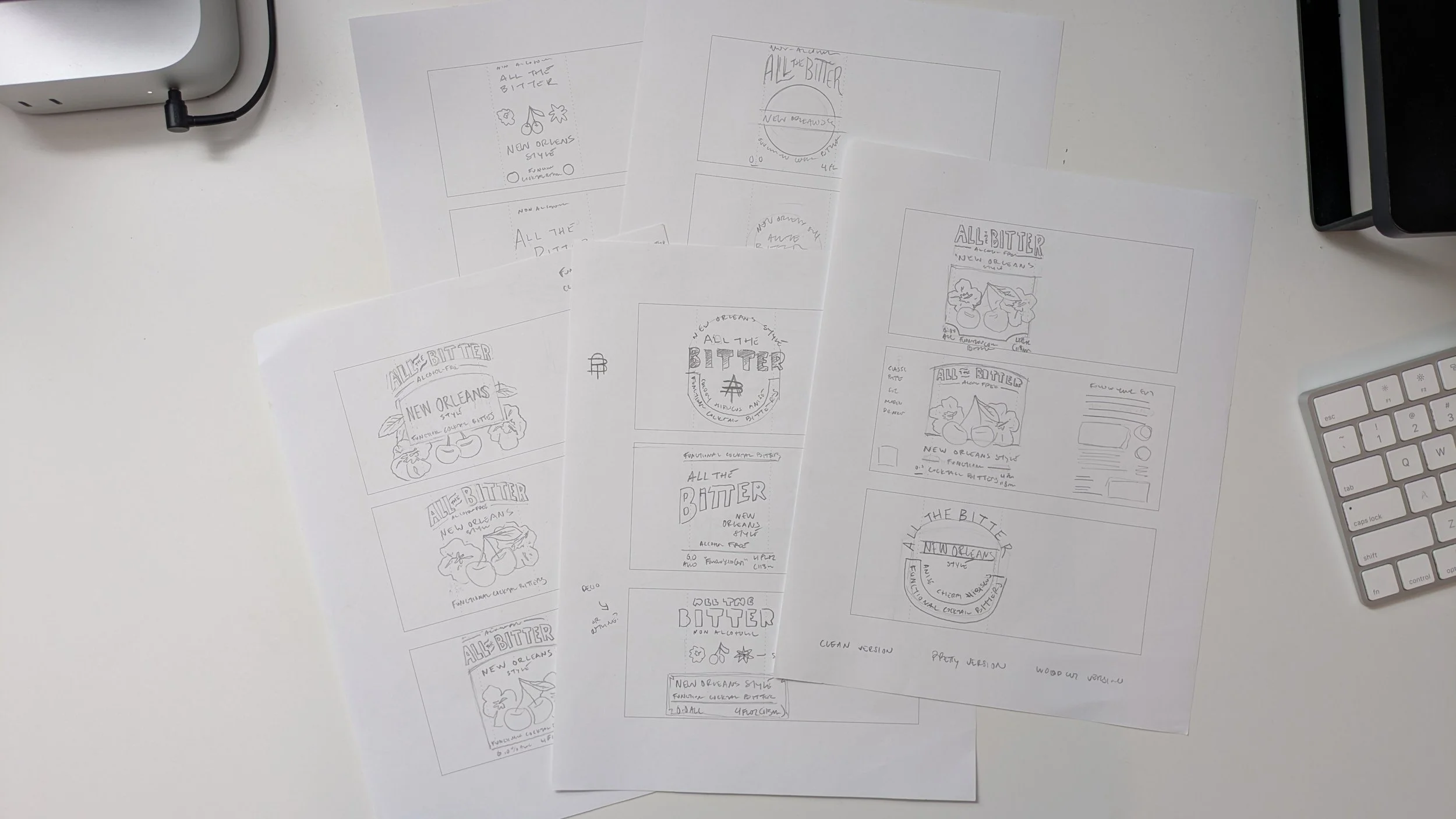
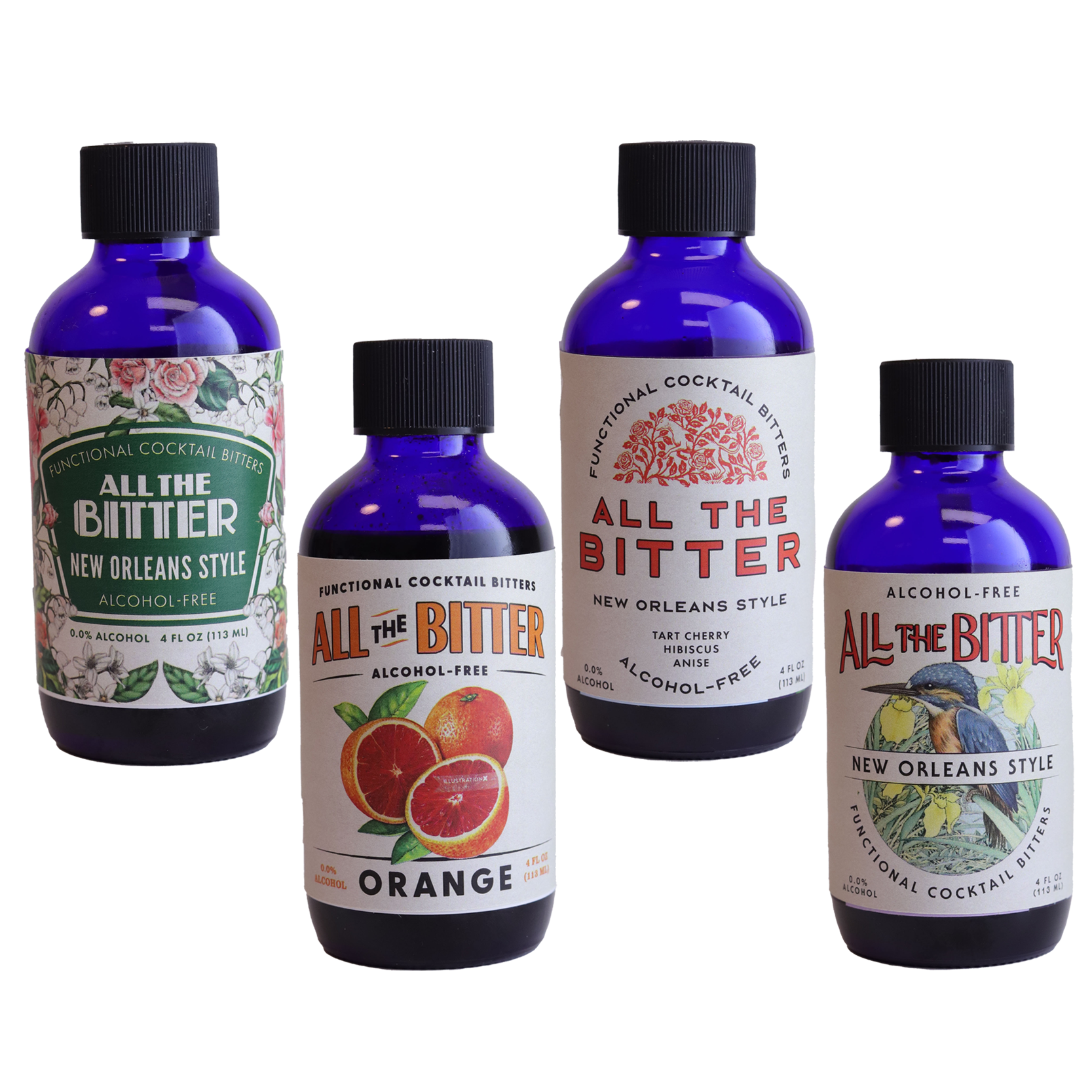
Early logo sketches and label designs.
Illustration Drove the Process
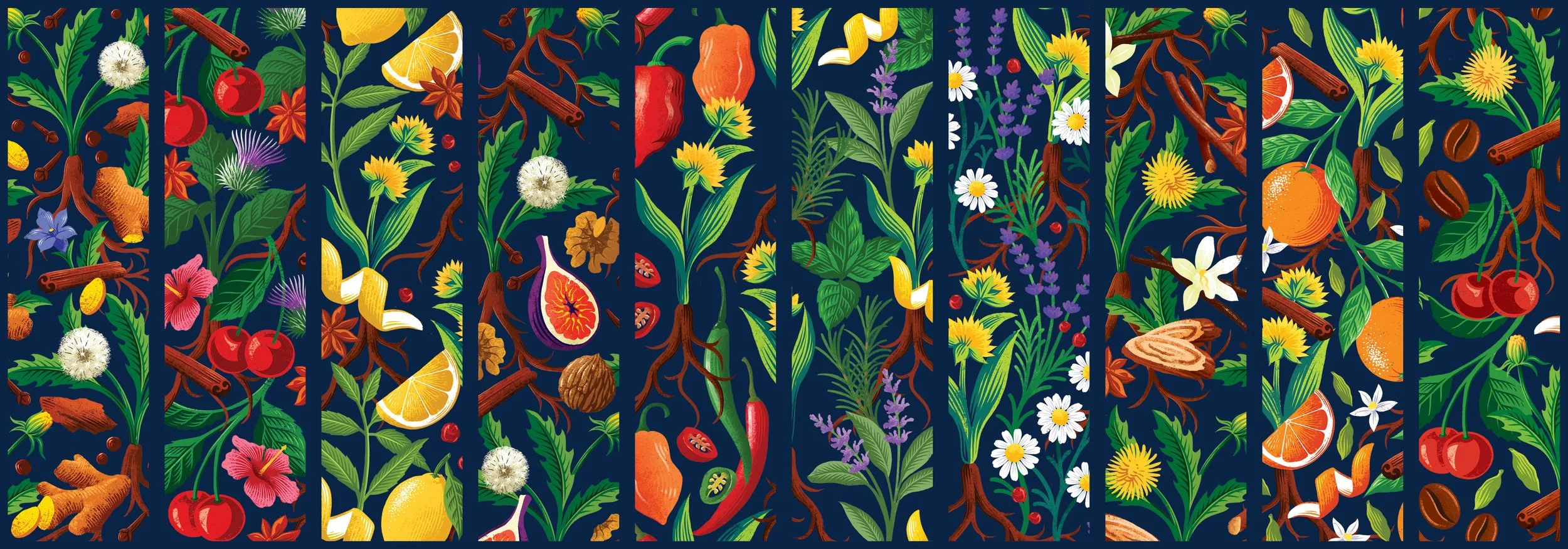
Priority number one in the design process was updating the illustrations for the packaging.
This was an integral piece of the original design system and something customers recognize instantly. Ian and Carly knew it was time to upgrade the illustrations to be more polished and refined. After an extensive search, we hired Ella Ginn and we began the long process of creating, editing, and refining art work for 10 flavors. These illustrations were then chopped up and broken out into individual icons to be used throughout the brand identity.
Before and After
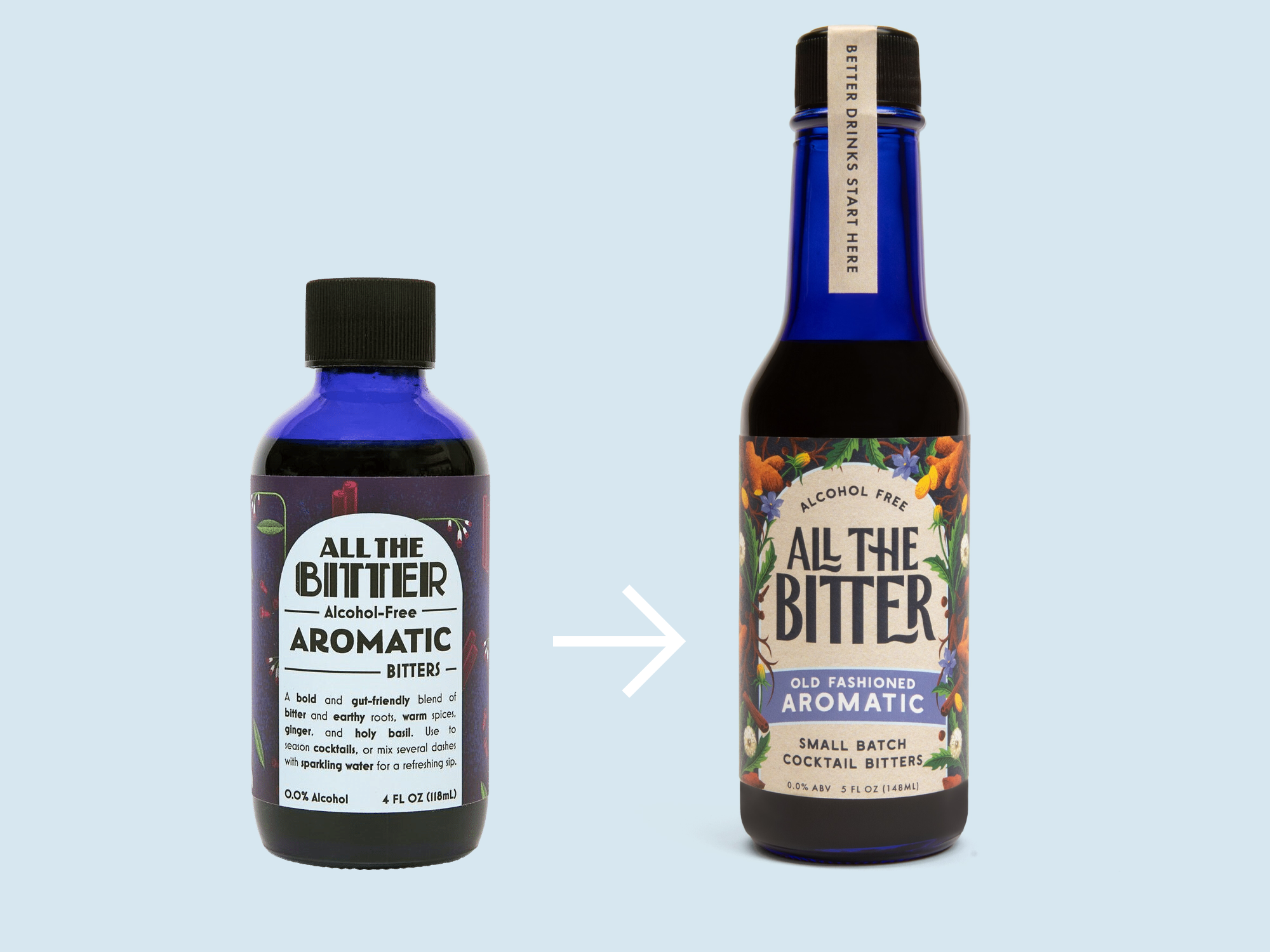
What stayed the same?
Iconic arch
Core color for each SKU
“Wallpaper” effect of the illustration
Blue bottle
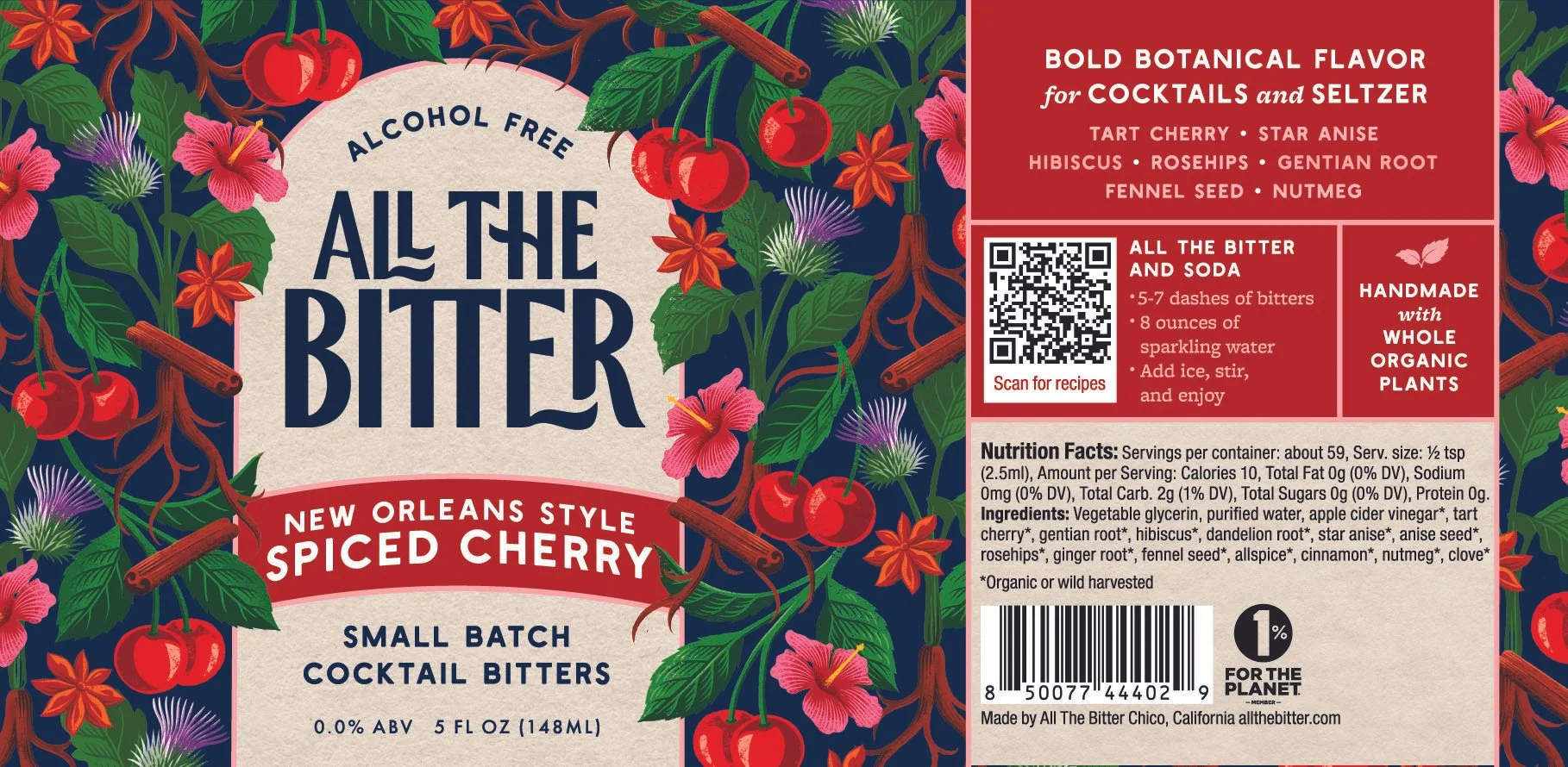
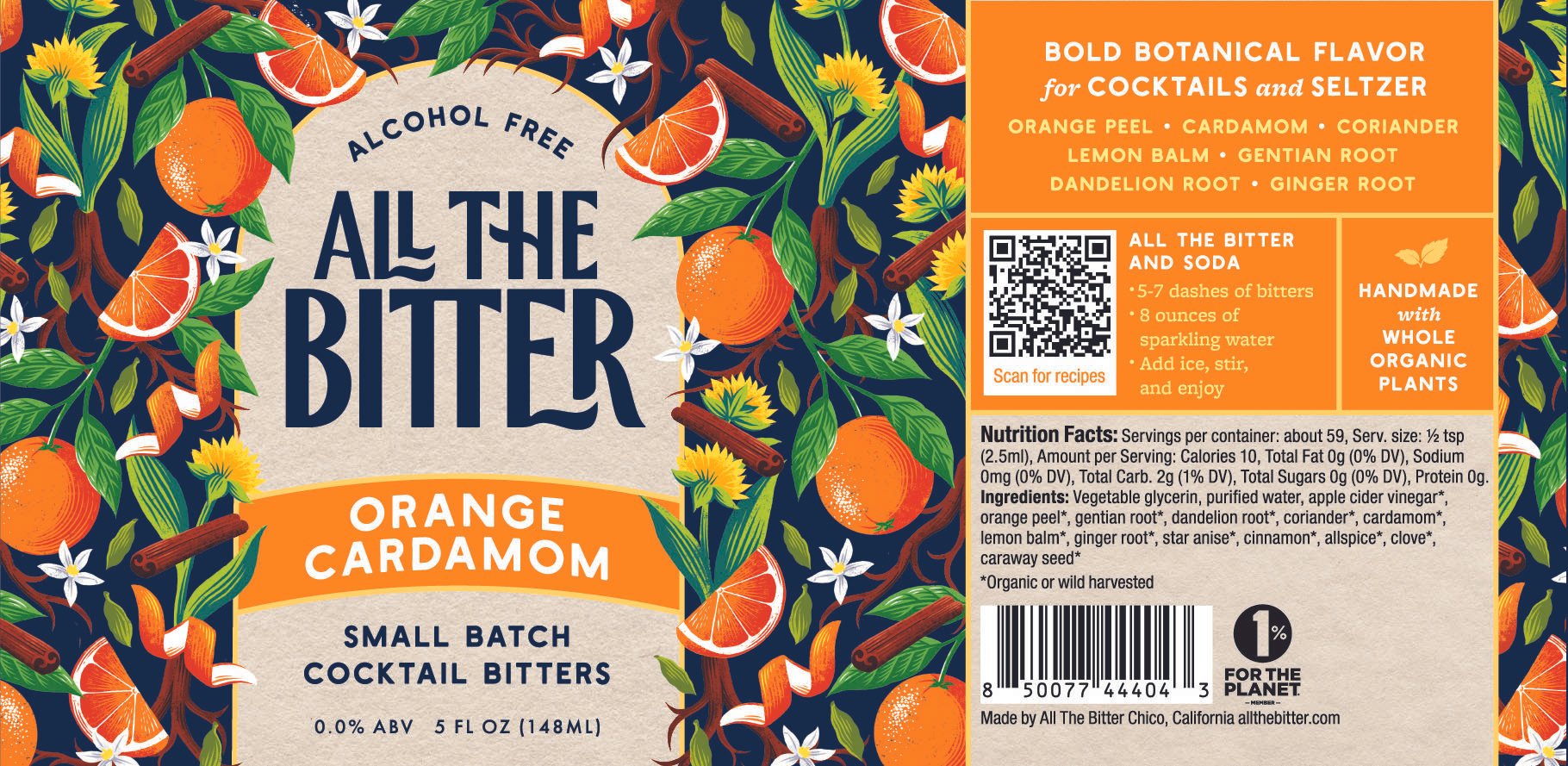
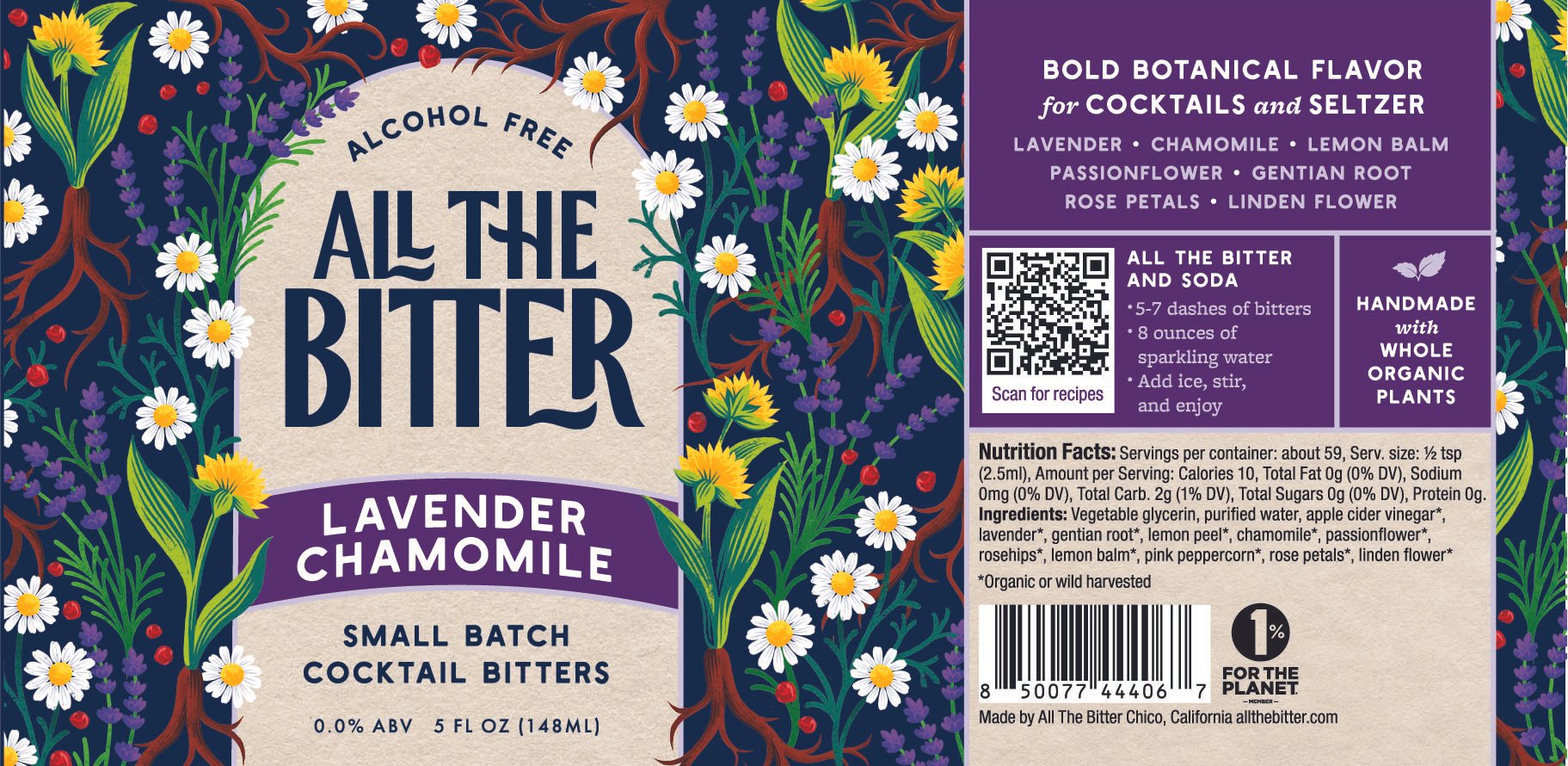
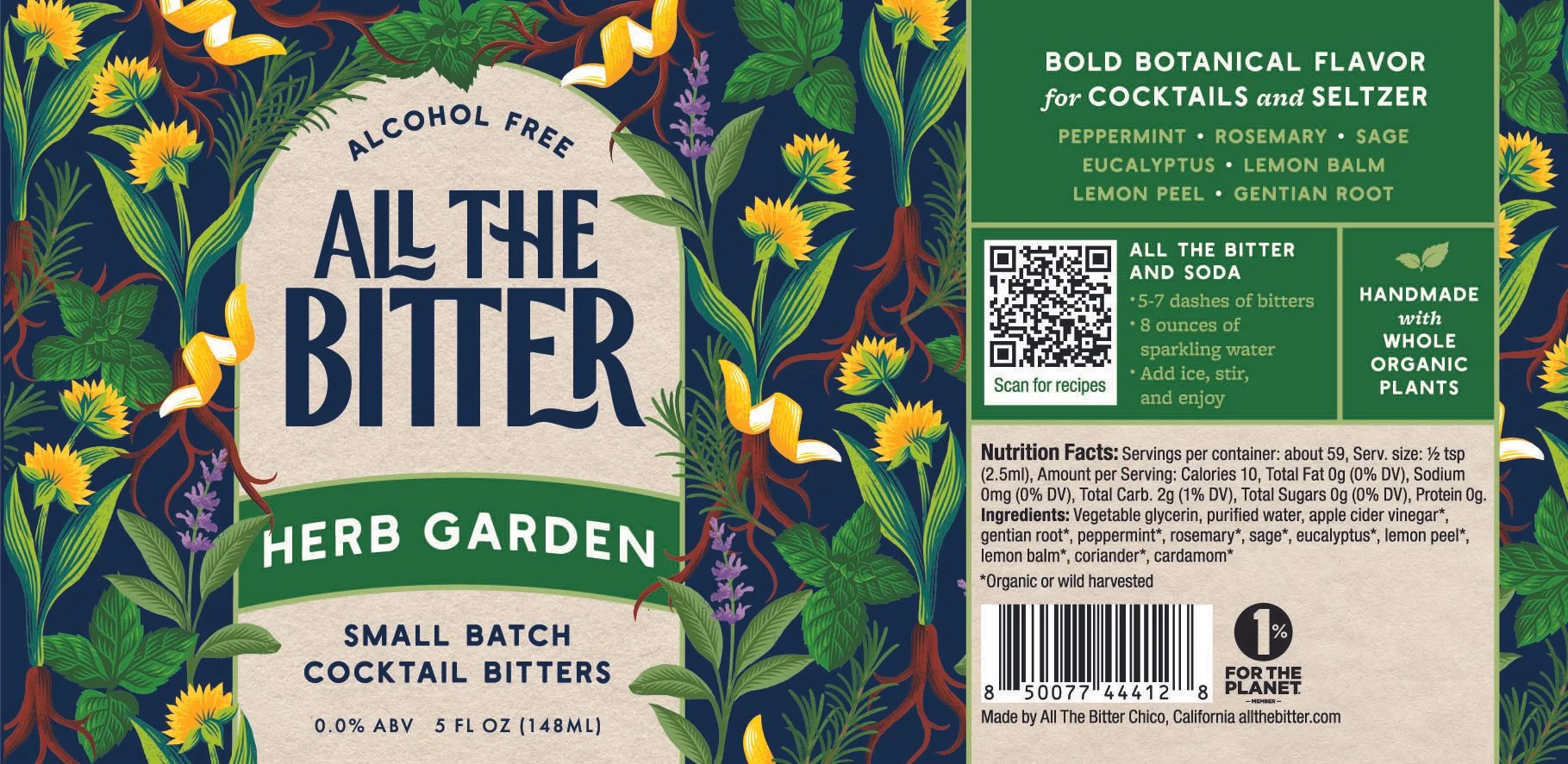
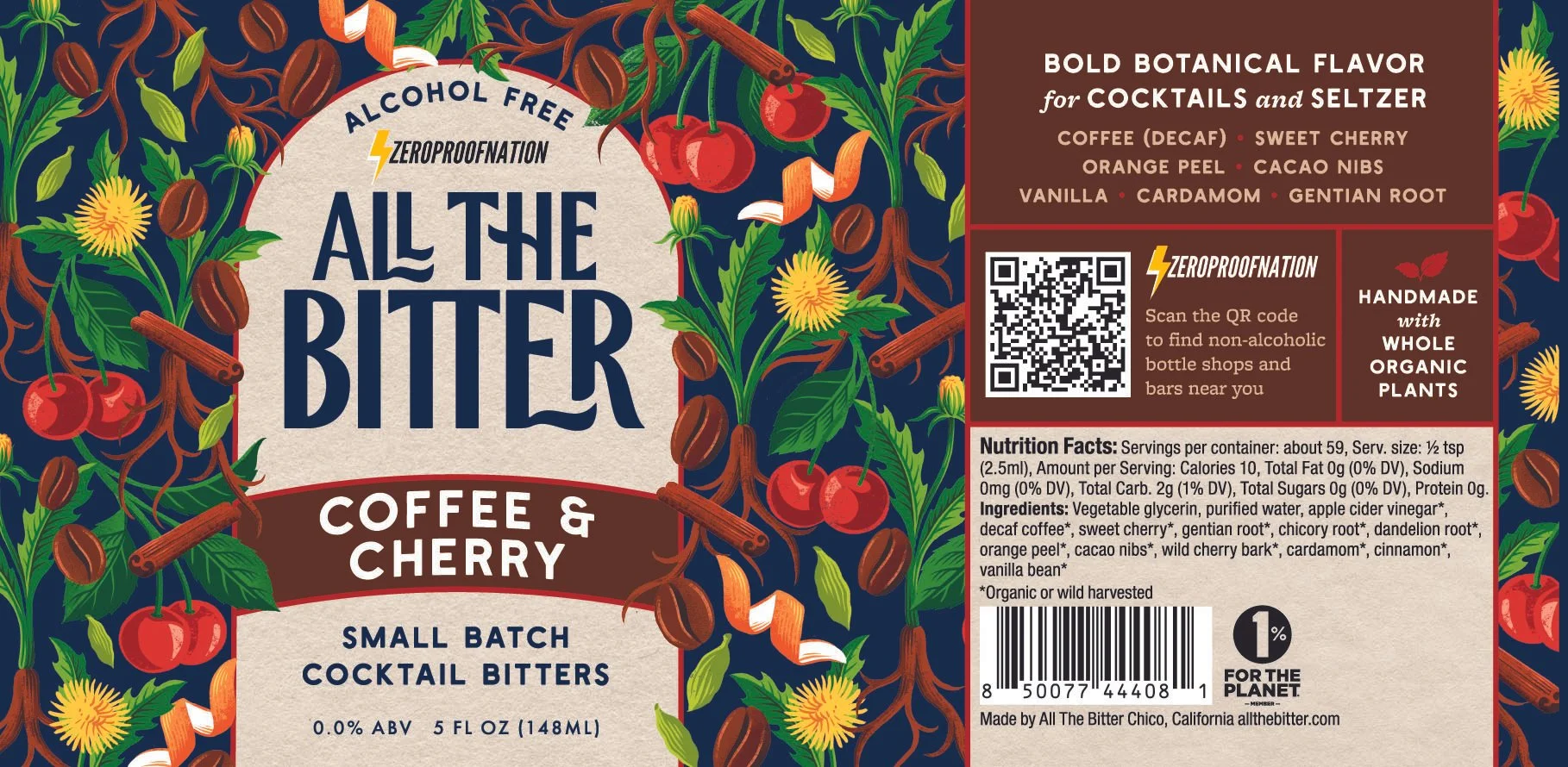
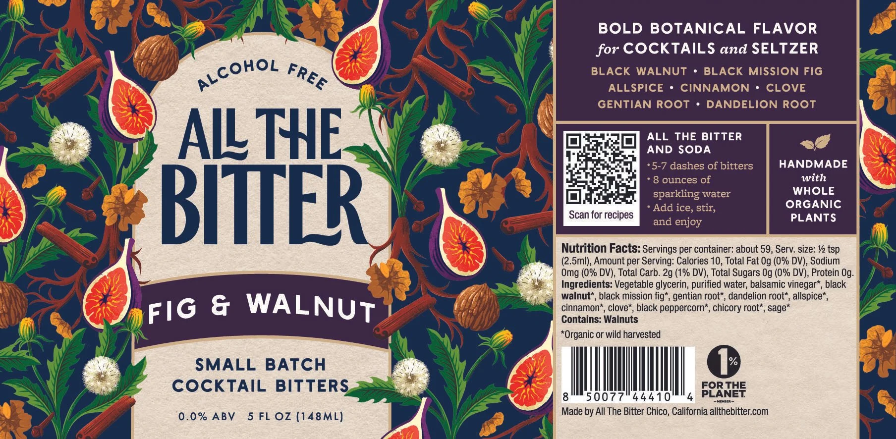
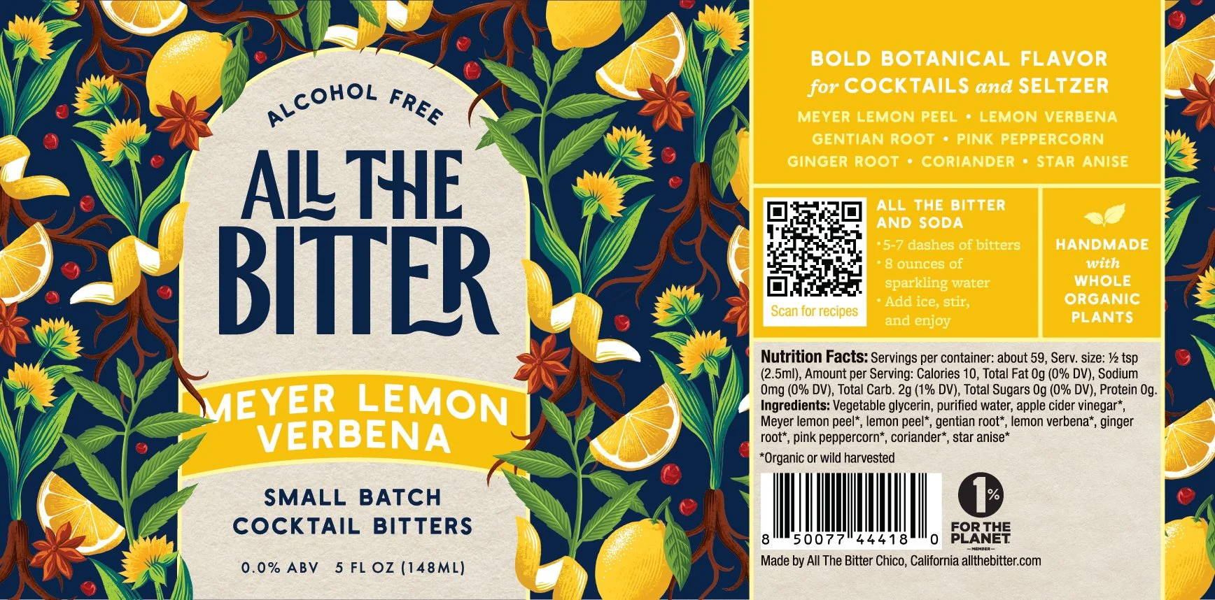
Final label design
What changed?
Reduced the amount of copy on the front of the label
New illustration
Names of SKUs to better reflect flavors
Alcohol Free more prominent
Simple descriptor that reinforces craft
Warmed up the color palette
Logo
Tamper evident seal
A Word from the Client
Bringing it all together.
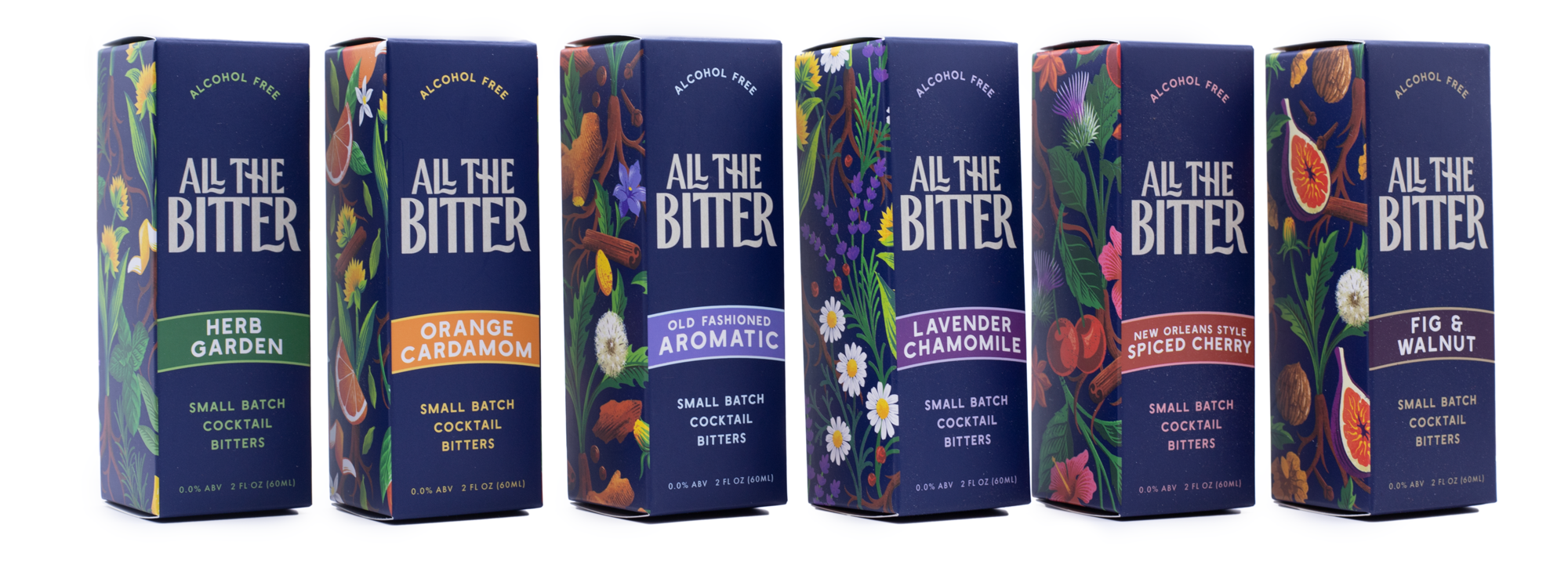
With one SKU completed, I could roll the design system out across the other SKUs and all three sizes.
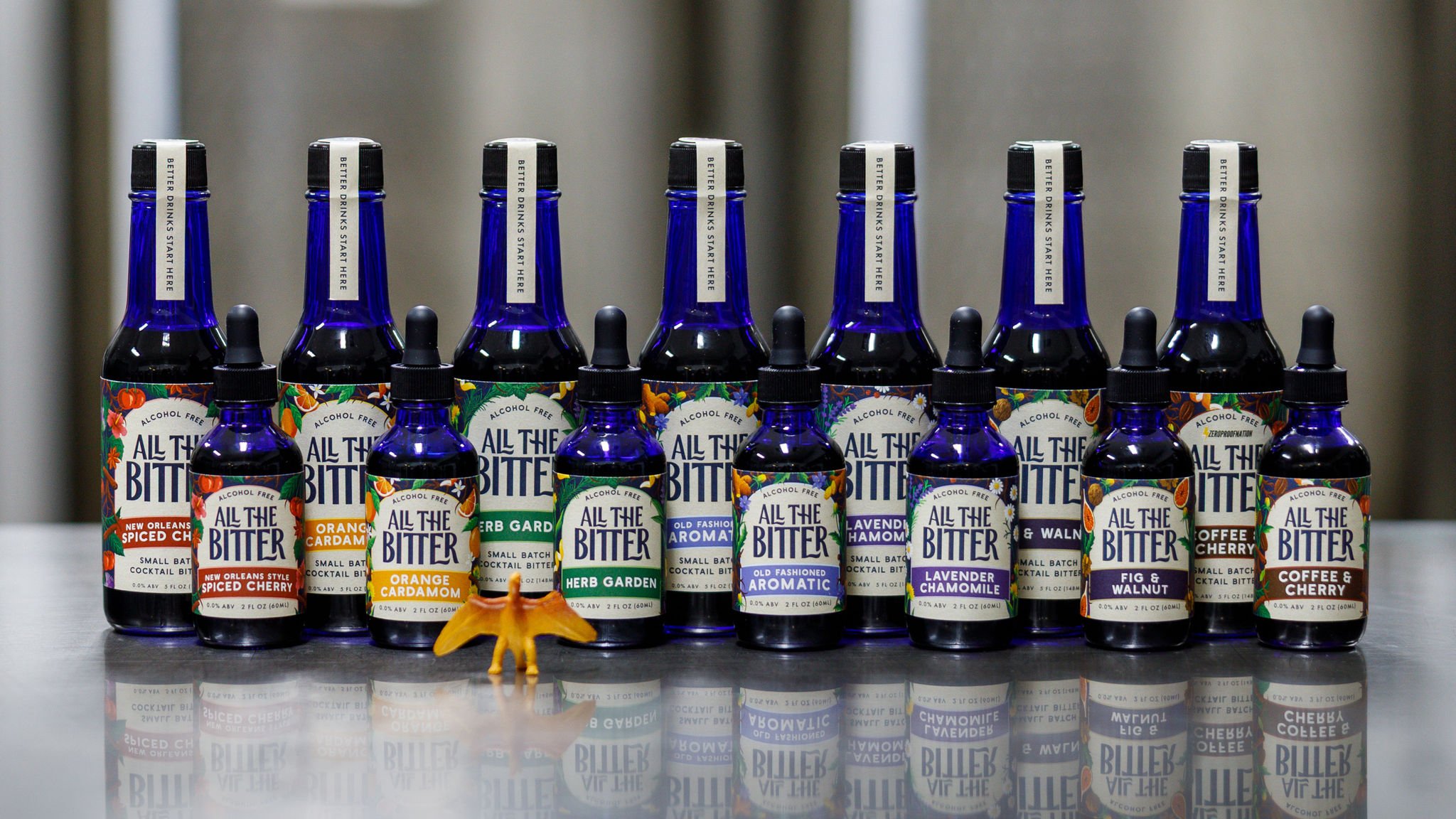
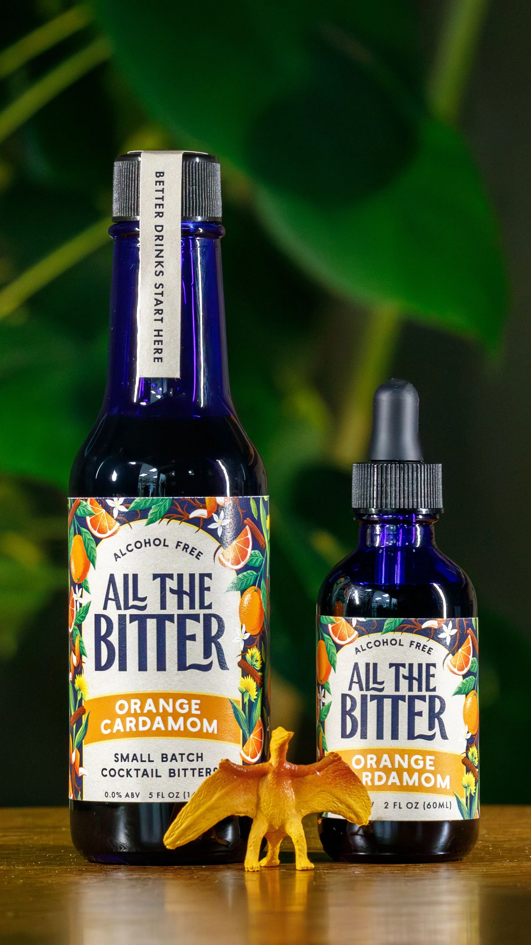
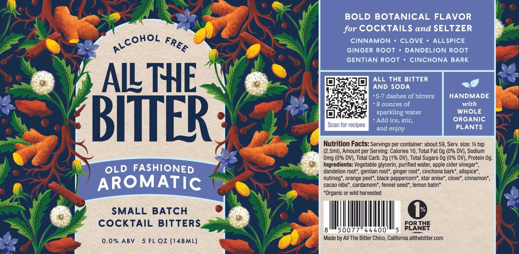

Complete Brand Identity
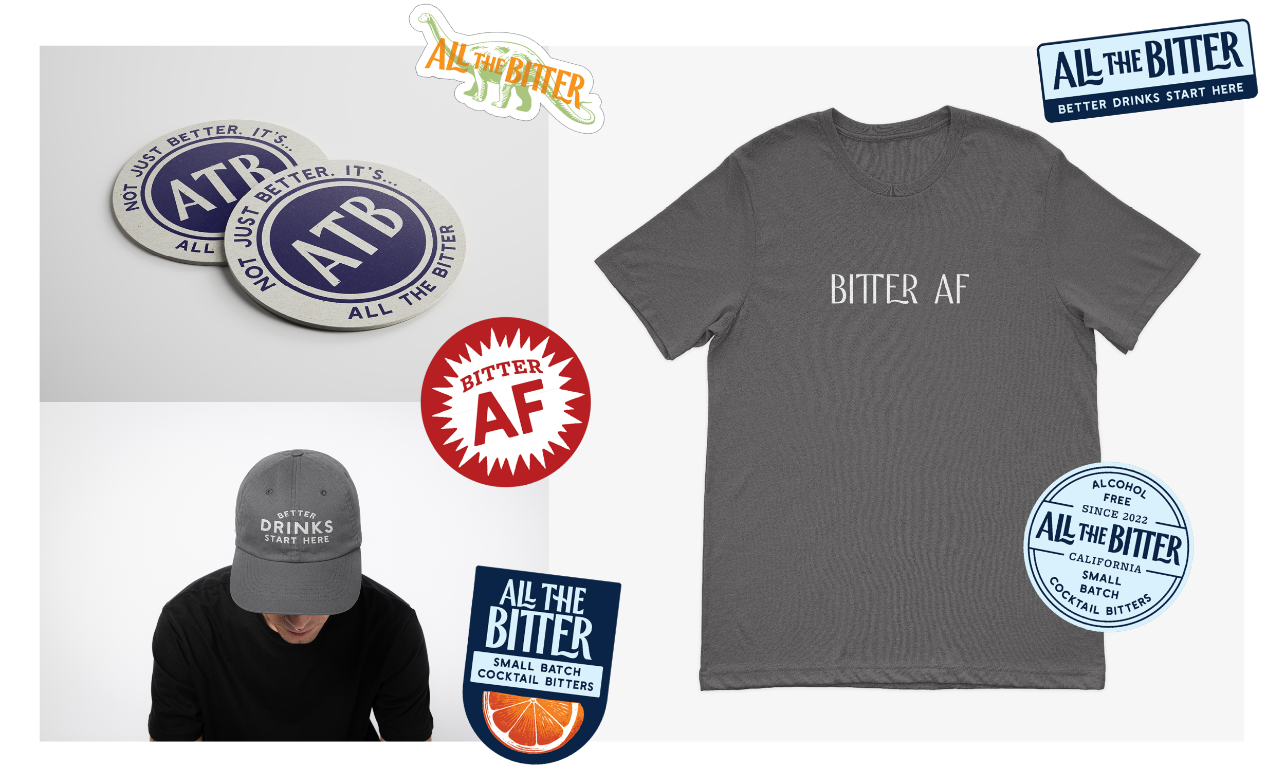
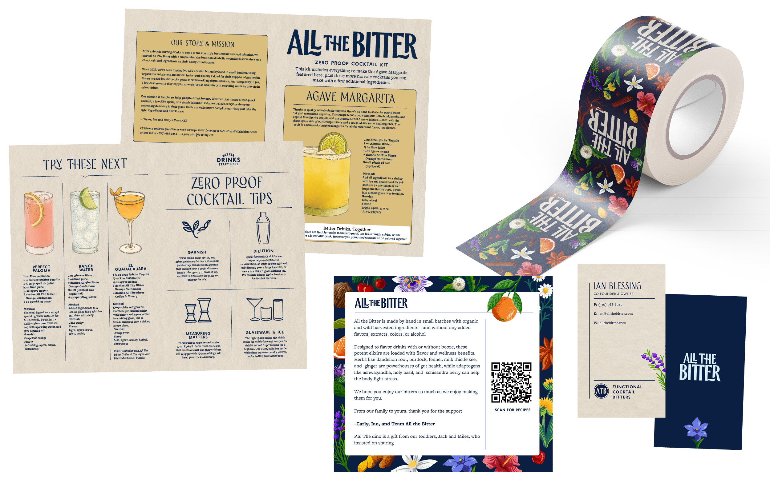
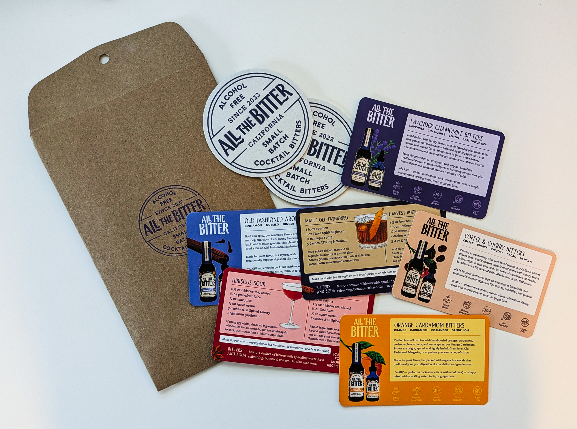
After the labels and box designs were completed, I moved on to building out the rest of the visual identity. This included a full suite of responsive logos, merch, sales materials, cocktail kits, a travel pack.
I then handed off a brand guidelines sheet to the team so they could seamlessly build the Shopify store.
What has been the response to the new packaging?
“We’ve already had retailers order the entire lineup in both sizes”
Ian Blessing, Co-Founder of All the Bitter
Does your brand new a refresh?
If you have been in business for 3-5 years it might be time for a packaging refresh.
Maximize the impact of your brand
Be more consistent and clear in your messaging
Capture the attention of new customers

