

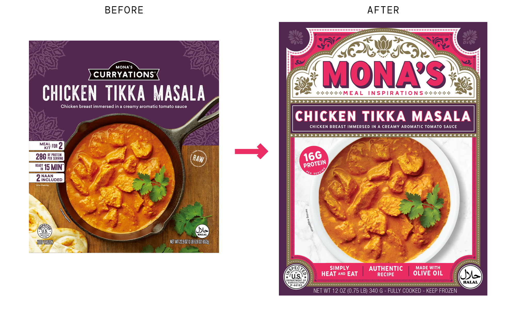
Mona’s Food Packaging Redesign Case Study
Lessons learned from my first packaging project to my most recent food packaging redesign.
Background
Mona’s was one of the first CPG packaging design projects I worked on when I started Coppergate Design Co. We met at Fancy Foods in NYC, hit it off, and eventually began work designing stand-up pouches for her frozen skillet meals.
Fast forward seven years, and Mona has learned a ton from the market. Her product is undergoing a couple of major changes that meant it was time to for a brand packaging overhaul as she prepares for the next chapter of her CPG business.
Change 1: Her product can now be microwaved. You no long need to cook it in a skillet on the stove-top.
Change 2: It will now come in a box instead of stand-up pouch.
Change 3: She is going to extend the line into different products and set in the store.
Change 4: She is simplifying the name from Mona’s Curryations to simply Mona’s.
Lesson 1: It is dark in the freezer aisle.
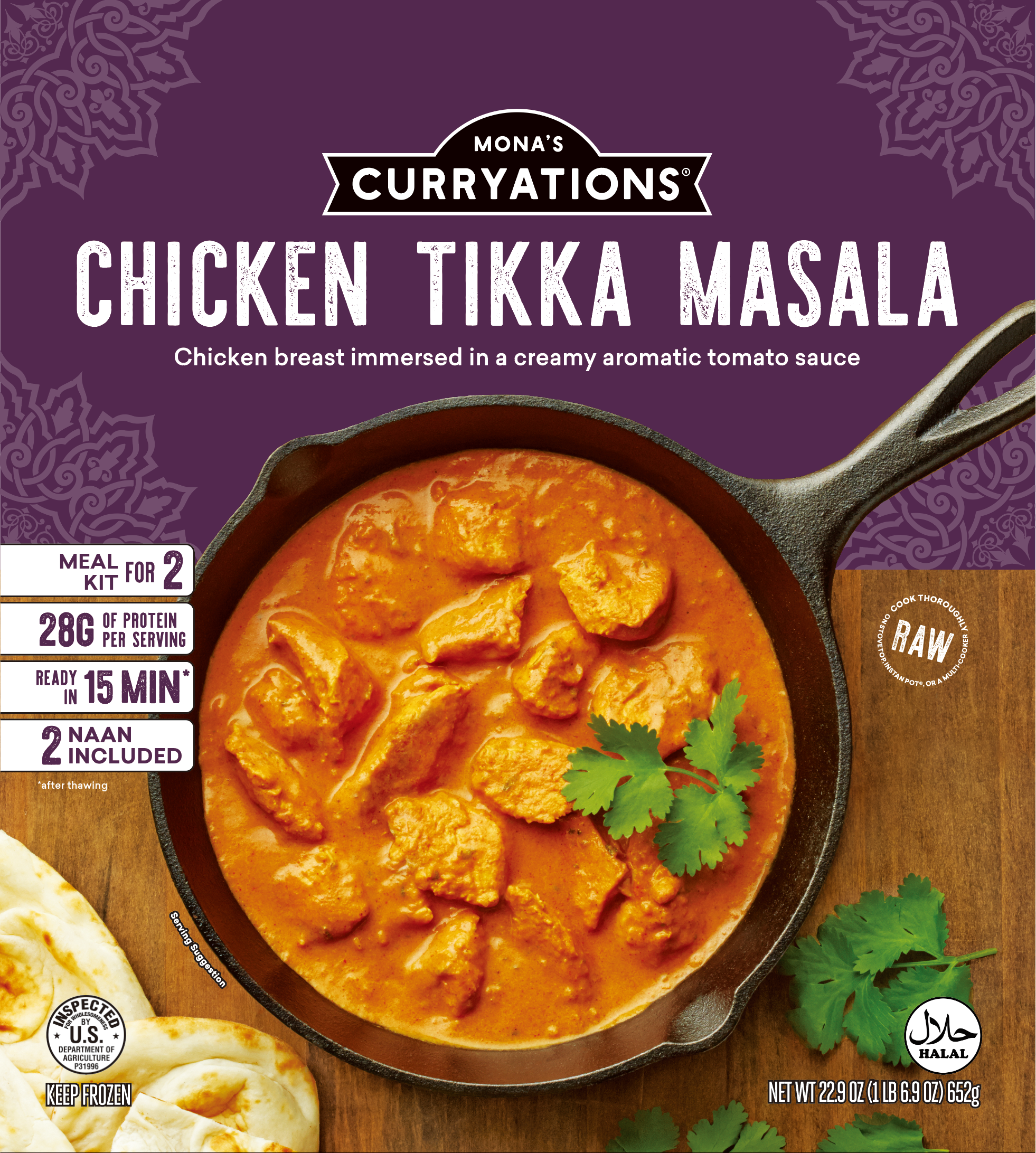
The original packaging featured delicious food photography and a distinctive color palette, but it got lost behind the frosty glass of the freezer case.
Mona’s original packaging did a couple of things right, but one big thing wrong. It was too dark. The primary brand colors of purple and gold, although distinctive, did not stand out in the poorly lit freezer section of the grocery store.
Same too for the food photography. The food looks delicious, but the dark wood background isn’t helping it pop.
In the refreshed packaging, I’ve removed the dark background and, more importantly, the dark skillet. This wasn’t just an aesthetic choice, it was a reflection in a change in the product. Mona is pivoting from a frozen skillet meal to a much more convenient microwavable format. So the skillet had to go.
I also combined the primary brand colors with a pop of bright pink to add energy to the overall design. This additional color will stop customers in their tracks and demand their attention. For returning customers it will act as landmark when scanning the aisle for their favorite product.
Lesson 2: Hierarchy is everything.
The order in which people read, process, and understand information is largely wrong on the original pack. We intentionally made the decision to lead with the flavor (Chicken Tikka Masala) instead of the brand (Mona’s Curryations) because at the time, I believed customers would be more drawn to the dish than a brand name that didn’t have any history.
People scan packaging in the following order:
Brand.
Product.
Flavour.
Claims.
Variant.
Benefit.
Reason to believe.
This hierarchy was out of order on the original pack. The new packaging follows the more traditional order of information, which leads to an easier buying decision.
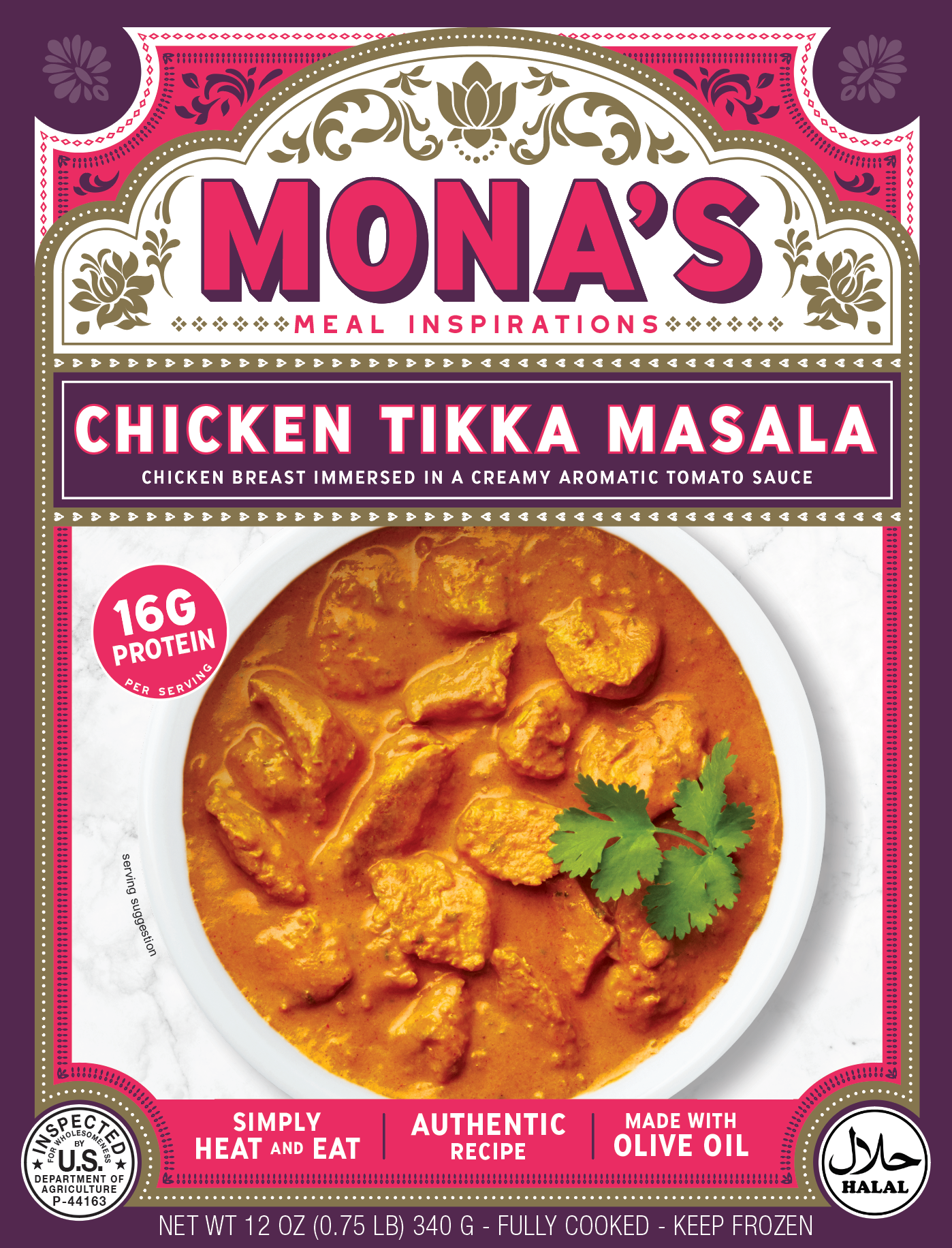
The new packaging tells a more complete story while adding a big punch of energy, color, and brightness.
Lesson 3: Zig where others are zagging.
Modern food packaging is dominated by minimalist design. So I opted for different approach in this.
This wasn’t just a response to the competitive landscape, but a way to reinforce the core differentiator of Mona’s products. She is a loving and passionate home cook with deep roots in world travel. Her recipes are inspired by her childhood eating home cooked Indian and Pakistani meals.
The original pack had hints of this history, but the new pack makes it obvious. It feels like a temple to Mona’s love of food and family. Customers will feel the history and authenticity of this food.
The new packaging will attract foodies who travel the world and want to experience the same food at home in a convenient, healthy, and delicious prepared meal.
If you are wondering when to redesign your food packaging I can help.
About Coppergate Design Company
Coppergate Design Co. is a branding and design agency for consumer packaged goods. I help small food and beverage businesses compete with big brands by designing world-class packaging, so your labels, boxes, website, and everything else look as cool as humanly possible and connect with your customers.
I'm here to help brands find their voice, and translate that voice to products that resonate with a passionate audience. Our clients are our partners in crime: I measure success by how our work together helps your company grow. Want to chat about your company, products, or goals? Drop a line to michael@coppergatedesign.com.