Hazard's Hop Water
My own personal beverage brand experiment
Year
2023
Timeline
Ongoing
Services
Strategy
Branding
Package Design
Logo
Refresh
Naming
Copywriting
Website

overview
Born out of a business partnership with brewery consultant Ryan Hansen, I started Hazard’s to prove to my clients that I practice what I preach.
Our positioning is unique. Our brand voice is sarcastic and snarky. We don’t take ourselves too seriously, but under it all there are some serious considerations.
We believe we make the best damn hop water east or west of the Mississippi. Our mission is to provide a fun non-alcoholic option to people who may not know about any NA options.
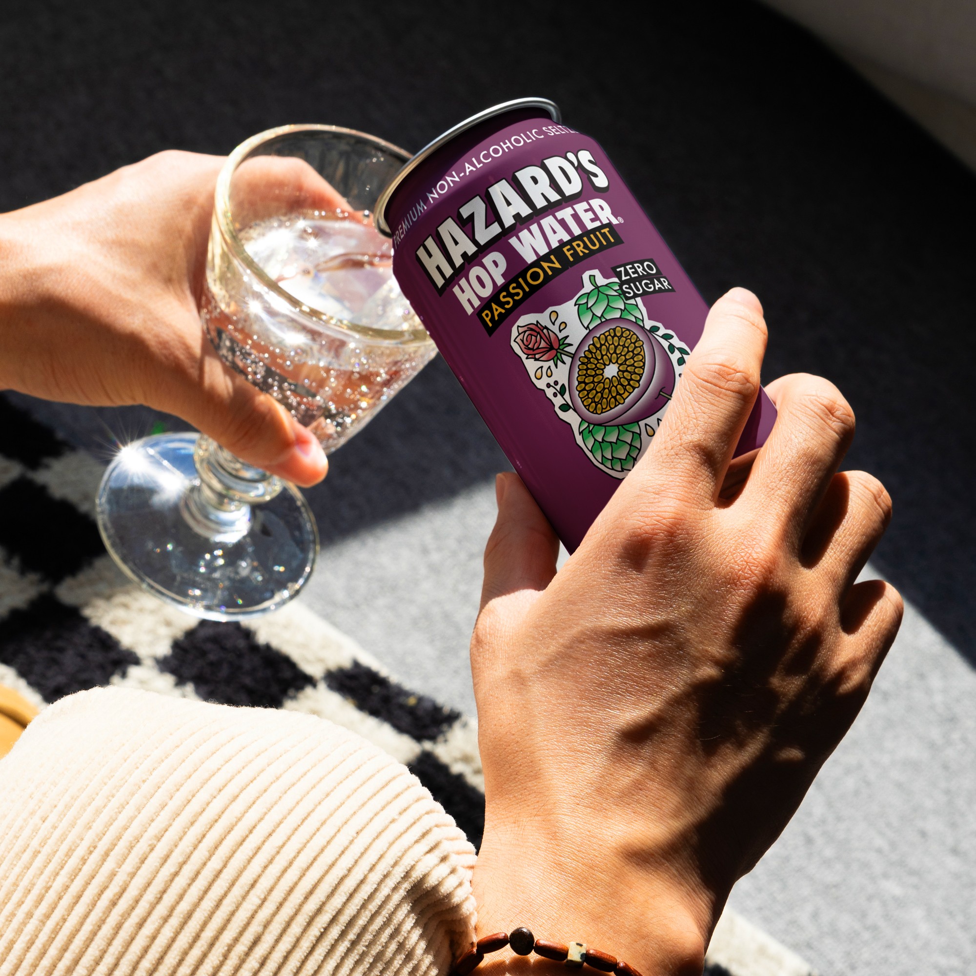
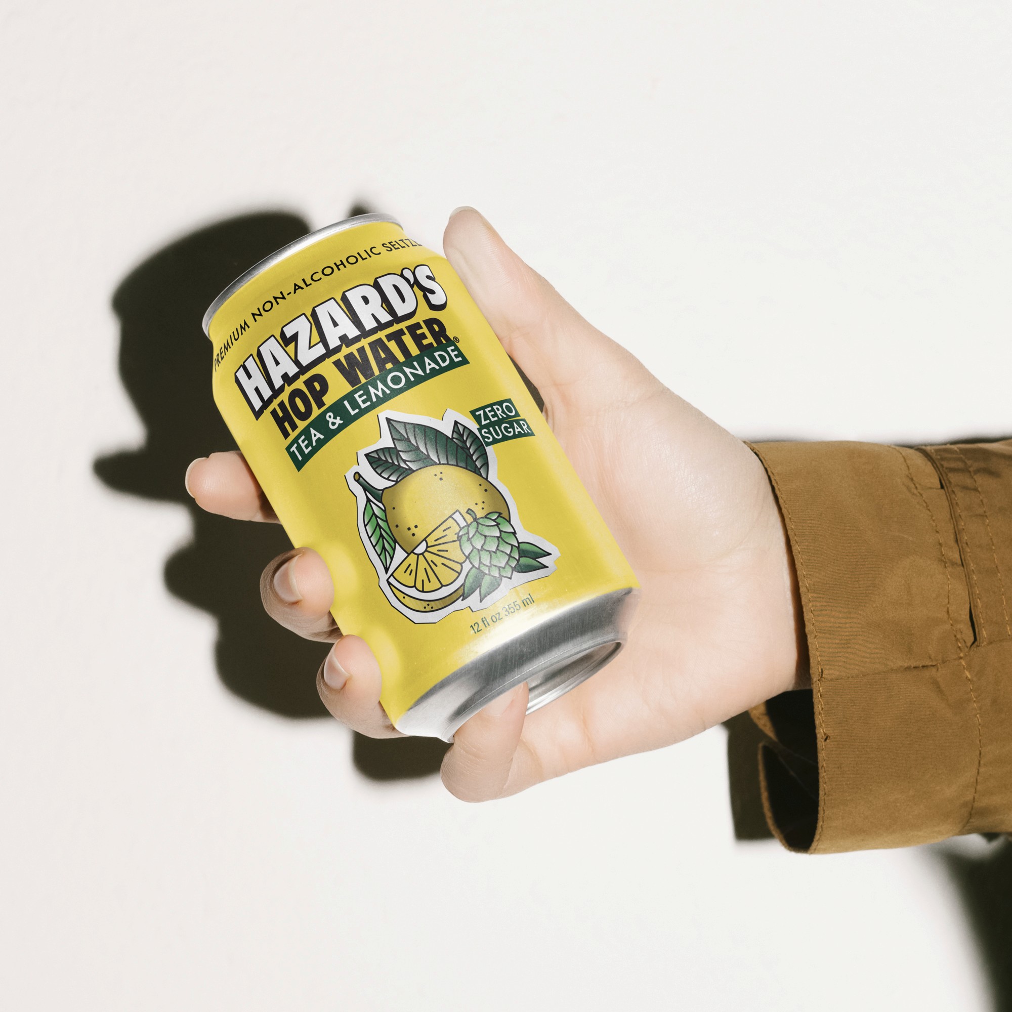
The design reflects our devil-may-care attitude through our tattoo style illustration and punk rock flyer inspired typography. We have created a brand that we think reflects who we are.
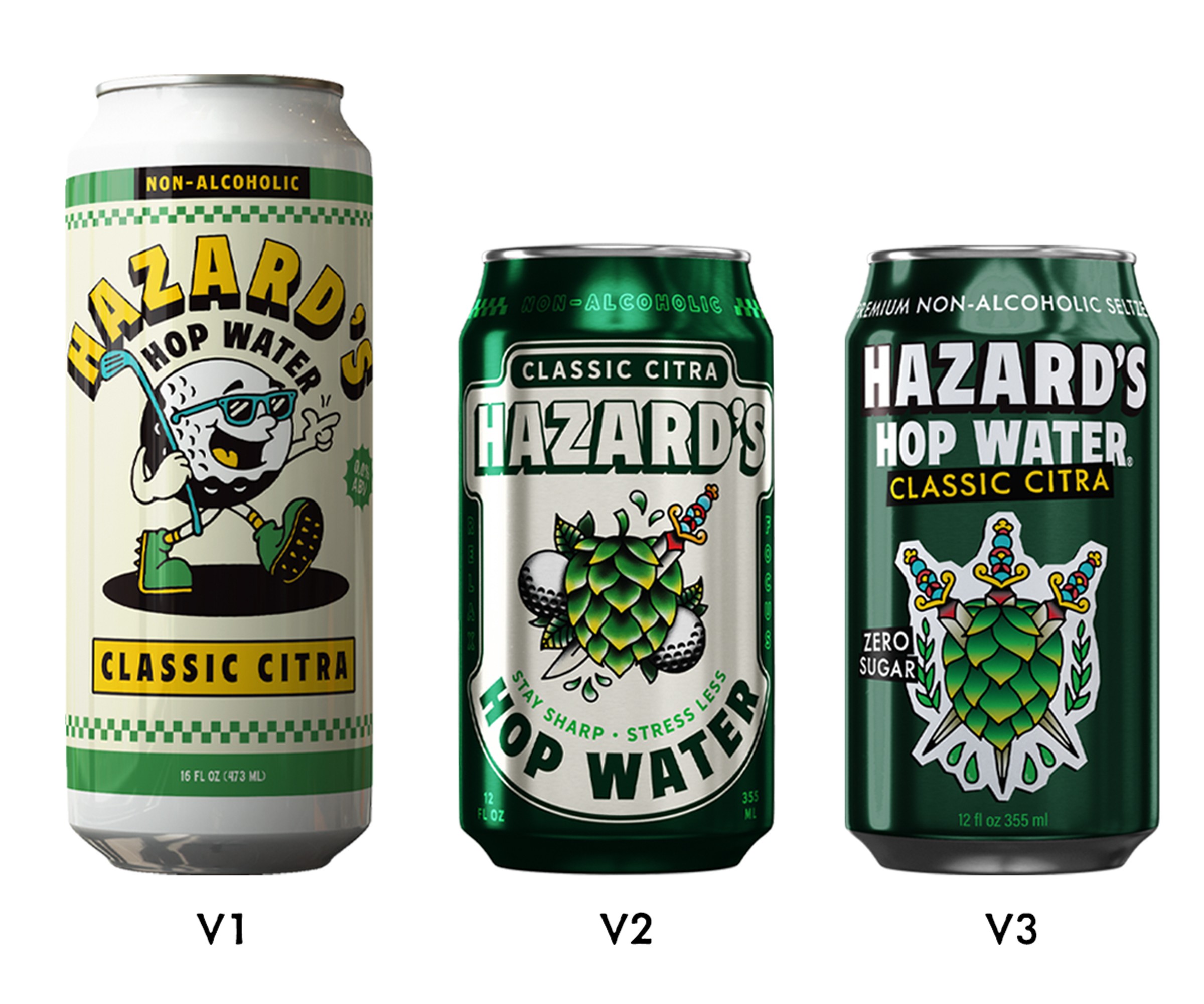
The evolution of our packaging.


It is very hard to read the label from inside the bottle. And by that I mean, it is very hard to take your own advice. I started Hazard's to prove a point. What I've ended up doing is making a lot of mistakes. We have actually redesigned our cans three times in three years.
the Result
We are growing slow but surely. But the speed of growth isn't the main point here. The point is that I know what its like to be on the other side. I have seen inside the beverage business from an owner's perspective. And I have made a lot of mistakes along the way. I want to pass that knowledge and wisdom on to my clients.
In the meantime, we have started to build a community of millenial dads who are getting back into skateboarding and punk rock as a way to spend more time with their kids.

Project Leader
Michael Wilson
Partners
Ryan Hansen and Micah Sampson
Printer
Craft Beverage Warehouse


